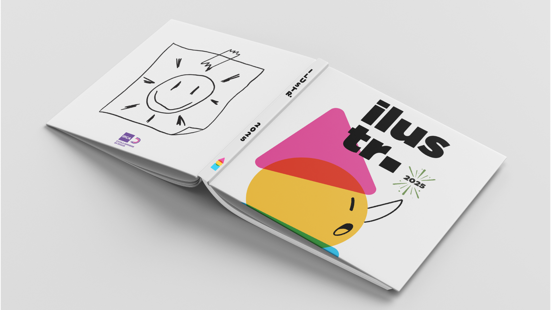
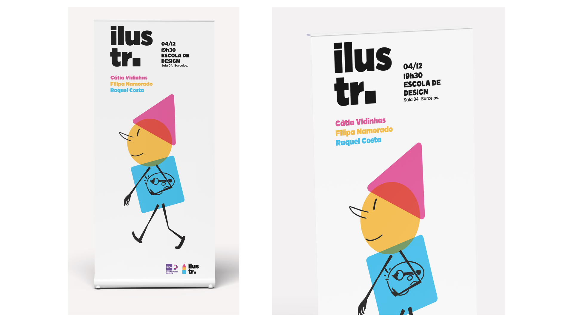
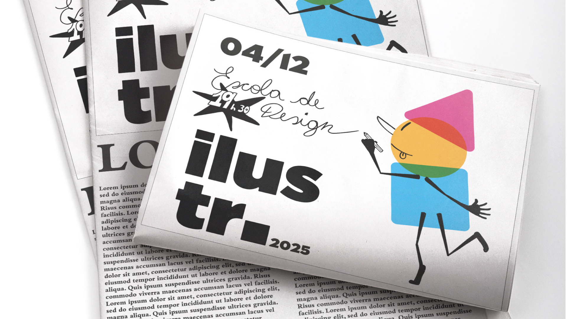
A visual identity project developed for ILUSTR., an illustration festival, focused on creating a flexible system applied across multiple event supports through a cohesive and expressive graphic language.
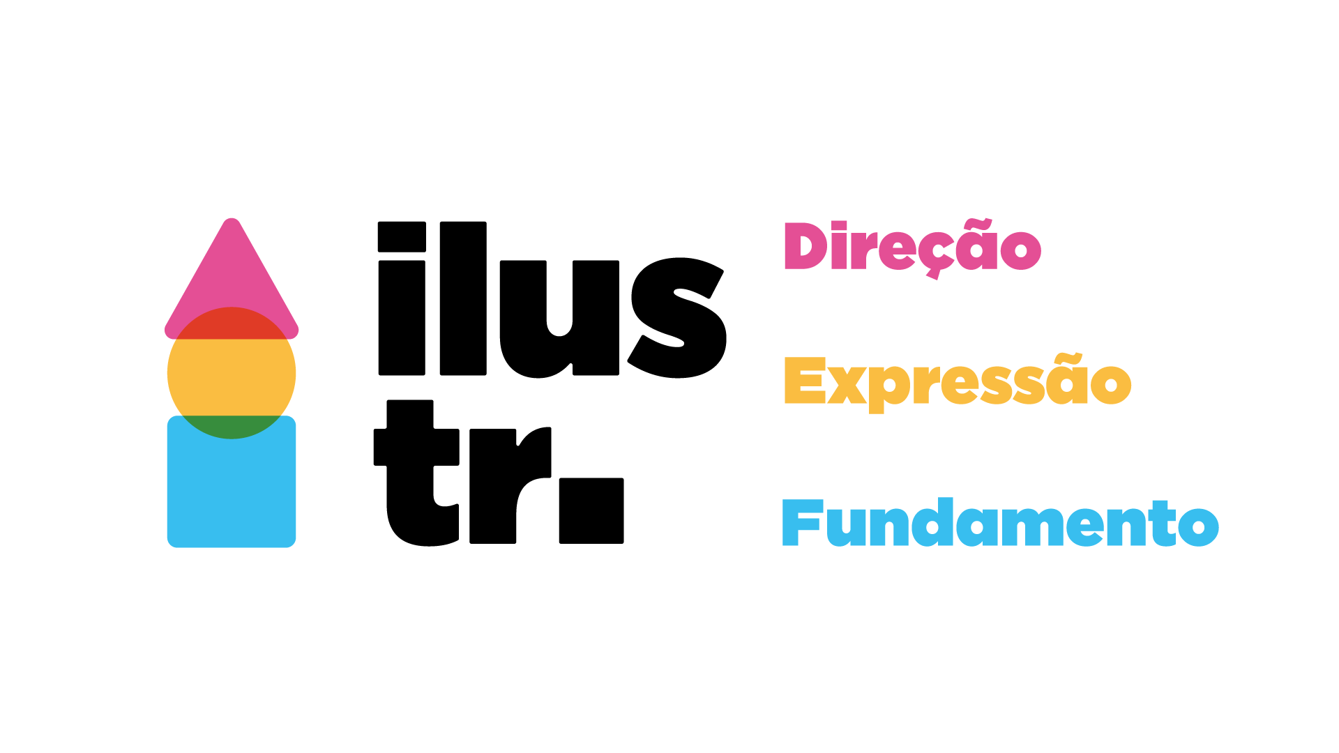
The process began with an exploration of fundamental principles shared across design fields, particularly illustration. The color palette was based on CMYK printing logic, while basic geometric shapes were combined using Gestalt theory to construct clear visual relationships and communicate meaning through simplicity.
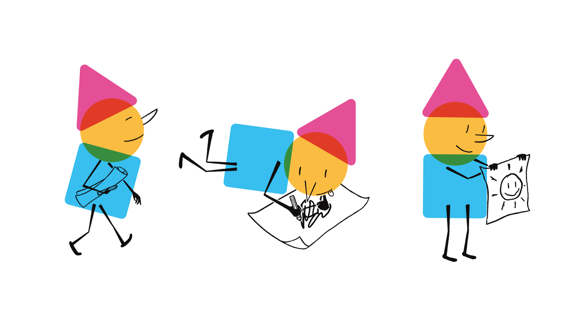
Through this structured approach, the elements converge into a symbol that forms a pencil, later expanded into a character that became the central figure of ILUSTR. This character guided the visual system, bringing consistency, movement, and personality to all applications of the festival identity.